
Essential Accessible Practices
The recommendations on this page aim to help you establish some general practices to follow when creating your content. The provided resources can help you confirm and check accessibility as you build materials and refine them over time.
On this page
- Body Text
- Titles and Headings
- Spacing
- Colour Contrast
- Hyperlinks
- Graphics
- Tables
- Videos
- Accessibility Checkers
Body Text
The text of your content will probably rely on font styling and spacing to create structure within the document. This section offers some best practices for each of these.
Font Styling
The font should be sans-serif and a comfortable reading size, usually a bit larger. Generally, use a font of 12pt or greater. Fonts that are sans-serif do not have any flourishes or embellishments on the ends of letters, such as Calibri, Century Gothic, Trebuchet, or Helvetica. Keep the font consistent throughout the content.
When using font styling, generally:
- Bold is used for text that should stand out prominently. Avoid using it for more than a key word or sentence or two.
- Underline should generally be reserved for hyperlinks.
- Italics should generally be avoided unless specified by an academic citation format such as APA or MLA or discipline specific use cases.
Spacing
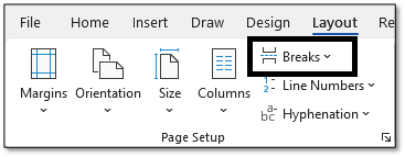
Use built-in spacing options in the software to change the arrangement of spacing between sections of text. Avoid using the Enter, spacebar, or tab keys to break up content, as these are read out loud by screen readers. For example, in Word you can use Page Breaks to be able to move content to a new page, Section Breaks to be able to set individual spacing for individual sections or pages, and Columns to be able to arrange text in vertical space.
Titles and Headings
Headings organize your content. They often work like a table of contents and provide people using screen-readers with a “map” of the information. Whether you’re working in documents, presentations, web content, or anything else, these are what render the content navigable by screen readers.
How to Structure Headings
Headings must be marked up using styles or tags. There are usually 6 levels of headings: H1, H2, H3, H4, H5 and H6. Headings level 1 is typically the most important, H2 is a subtitle of an H1 section, and so on. Many documents typically use H1, H2, and some H3. Lower levels are rarer.
Some additional guidelines:
- Do not use font styling like all caps, bold, or italics instead of heading tags.
- Headings are hierarchical. Do not skip headings from small to large (ex. Use H1, and any subheadings are H2, never jump from H1 to a subheading of H3 or H4).
- You can change the appearance of a heading, so don’t choose headings based on their style.
Example
The following example represents headings used on this page. Heading levels have been indicated after each.
Essential Accessible Practices (Title/H1)
- Body Text (H2)
- Font Styling (H3)
- Spacing (H3)
- Titles and Headings (H2)
- How to Structure Headings (H3)
- Example (H3)
- Colour Contrast (H2)
- Choose Accessible Colour Combinations (H3)
- Combine Colour and Another Indicator (H3)
- Incorrect Example (H4)
- Correct Example (H4)
- Use a Colour Contrast Checker (H3)
- Hyperlinks (H2)
- Example (H3)
- Alt Text (H2)
- Example (H3)
- Tables (H2)
- Example 1: A Simple Table (H3)
- Example 2: A Complex Table (H3)
- Videos (H2)
- Accessibility Checkers (H2)
Colour Contrast
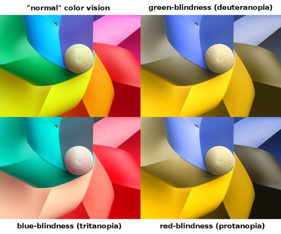
While colour has a valuable visual impact on learning materials, we may want to keep learners with colour blindness or low vision in mind. Consider whether your use of colour is purposeful and done in ways all learners can perceive.
Accessible Colour Combinations
Generally, the most accessible colour combinations are:
- Black (or dark grey) and white for text and backgrounds;
- Dark blue for hyperlinks or accessory text;
- A non-bright orange for highlighting or other forms of non-text annotation.
- Bold can also support higher contrast lettering if used purposefully for focal text.
Combine Colour and another Indicator
Avoid using colour alone to indicate something that is important. Instead, combine colour and text or colour and shapes with styling information. A great way to evaluate whether colour contrast is sufficient is to imagine you could see no colours – would you still be able to distinguish any differences?
In the following example, the two tables represent an incorrect and correct example of colour usage. The incorrect example only uses colour to indicate registration status, whereas the second table uses both colour and text. The correct example also avoids red/green colour combinations, which are less perceptible by those with colour-blindness.
Incorrect Example
| Date | Workshop |
|---|---|
| Dec. 15th | EDV0123: Teaching and your Course Outline |
| Dec. 16th | EDEV0124: Managing your Class |
Green= Registration open
Red = Registration closed
Correct Example
| Date | Workshop |
|---|---|
| Dec. 15th | EDV0123: Teaching and your Course Outline Registration Open! |
| Dec.16th | EDEV0124: Managing your Class Registration Closed |
*See the Portal for registration
Use a Colour Contrast Checker
For simplicity, you might rely on black or white as background colours. However, any background colour can work if there is high enough contrast with the text. For example, light colours like this blue have sufficient contrast with black text to read comfortably. Bright, warm colours like pink, yellow, red, and orange should generally be avoided as background and text.
Contrast checkers help evaluate whether one colour has sufficient contrast to other colours it interacts with. If you like to use colour, you’ll want to use a colour contrast checker to make sure your colours are readable.
Contrast checkers will compare two colour’s hex codes. Learn how to find the hex code in commonly used Microsoft products or use any other commonly available colour picker to find a colour from an image.
Once you have the hex code for the colour, then try one of these readily available contrast checkers:
- Adobe Colour’s Accessibility Tools
- WebAIM’s Contrast Checker
- Another easy-to-use colour contrast checker.
Hyperlinks
If a screen reader comes across a url it will read the url letter by letter to the user. This experience is incredibly unpleasant and makes it hard to understand where the link is directed.
Instead, links should read like a sentence or phrase and tell the learner where they will go if they click. The process of creating this is typically called an embedded link. Create an embedded link using the right-click menu or the keyboard shortcut CTRL+K (Windows) or ⌘+K (Mac).
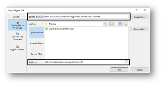
Embed hyperlinks in meaningful text rather than pasting in the full web url. Text such as “click here,” “more,” or “read more” does not provide any helpful context to the reader. Instead, make the link into a sentence that, if read completely alone, would help you understand where it will take you.
Example

If choosing the colour of the linked text, it should be distinct from the rest of the text and always be underlined. Hyperlinks are usually dark blue, though branding guidelines or preferences sometimes call for other colours.
Graphics
Include alternative text (alt text) on any images, graphs, figures, or icons to explain the visuals to any assistive tech users. For infographics, learn to develop accessible PDFs to render the content readable.
Alt-text is written by the document author, and should:
- Be concise and brief – usually a sentence or less.
- Give the essentials of the visual information presented.
- Provide any additional or necessary context that the visual might require.
Good alt text should aim to be a sentence or two that explains the essential information the reader requires to make sense of what it conveys in the context of how it will be used.
Example
Consider the following image. Which example of alt text might you choose?
- A dog.
- A picture of a small terrier dog.
- A small terrier dog.
- A small terrier dog with its mouth open and ears attentive.
In this case, the most suitable choice would be either option C or D, depending on how much context the reader needs. Option A is too brief, and option B unnecessarily specifies this is “a picture.”

Tables
When creating tables, avoid using screenshots or images of tables. Instead, use built-in options to build tables directly into the document, presentation, or other software. Use a caption to give a summary of what the table’s data reflects.
Design tables as simply as possible. Include one header row and, if needed, one header column. Each of these should describe the data in the cells. If you have a more complex table, try breaking data into multiple tables with simpler formatting.
Example 1: A Simple Table
| Start Date | New Students – Deposit Due | Returning Students – Deposit Due | All Students – Balance of Fees Due |
|---|---|---|---|
| 2022 Spring (May) | February 18, 2022 | April 6, 2022 | May 24, 2022 |
| 2022 Fall (Sept) | June 15, 2022 | July 22, 2022 | September 21, 2022 |
| 2023 Winter (Jan) | October 19, 202 | November 25, 2022 | January 23, 2023 |
| 2023 Spring (May) | February 17, 2023 | April 5, 2023 | May 22, 2023 |
Example 2: A Complex Table
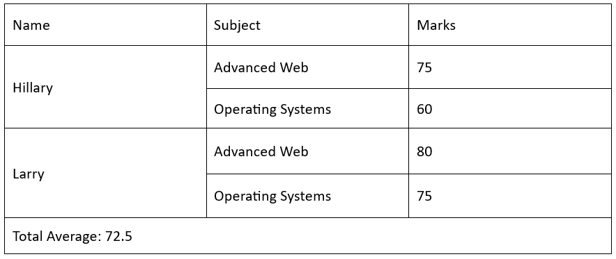
Example 3: Complex Table Simplified
| Student Name | Marks – Advanced Web | Marks – Operating Systems |
|---|---|---|
| Hillary | 75 | 60 |
| Larry | 80 | 75 |
Videos
Screen readers recognize video content and understand how to interact with it. However, additional considerations can be made to create an accessible video-viewing experience.
- When linking videos, follow the recommendations around adding hyperlinks.
- Embedding videos helps avoid advertisements and other visual clutter.
- Always turn on closed captioning and play the video in full screen mode.

If you’d like to show a video in class but captioning doesn’t appear available, contact the Library for help.
Accessibility Checkers
Documents, presentations and PDFs can all be checked for accessibility problems using accessibility checkers built into the software that they are built in. Accessibility checkers screen a document or resource for components that violate typical accessibility expectations, such as failing to add alt text to images or including tables with merged cells. These concerns will be flagged for review and often are presented with an explanation of why this concern impacts accessible practices, as well as recommendations for resolving the issue. Accessibility checkers can typically be found in the main menus of any popular content creation software
Learn more about accessibility checkers built into commonly available software in the resources below.