
Documents
The practices on this page aim to help you create accessible collaborative or static documents. As you create your documents, keep these suggested practices in mind.
On This Page
- Body Text
- Titles and Headings
- Spacing
- Colour Contrast
- Hyperlinks
- Graphics
- Tables
- Document Properties
- Accessibility Checker
Body Text
Use the default text style to ensure consistency in your document’s text formatting. Document fonts should be sans-serif, and generally a size of 12pt or higher. Examples of accessible fonts include Calibri, Century Gothic, Trebuchet, or Helvetica.
When styling fonts:
- Use bold text sparingly and strategically to highlight a keyword or sentence in a paragraph.
- Underline should be used primarily for hyperlinks.
- Italics should be generally avoided unless specified by an academic citation format like APA or MLA.
Titles and Headings
Use title and heading styles to designate sections of the document. There should generally be only one title, while there may be many headings and heading levels. Heading levels should generally be organized into main headings and subheadings. This is usually done in document processing software, which uses Styles to construct the levels of each heading.

Spacing
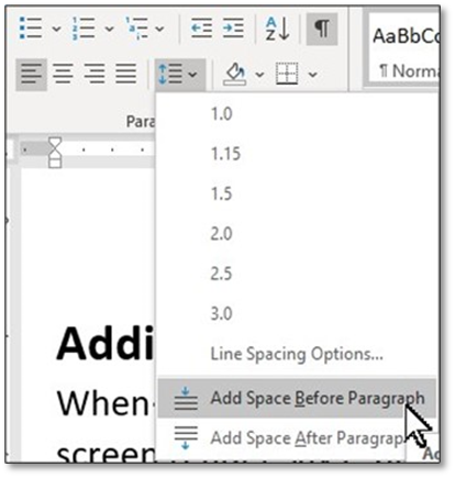
Using the Enter or Tab buttons to add spaces to your document leaves it filled with undefined formatting, which is hard to read for those using screen readers. You can monitor these spaces by turning on the Formatting View.

Generally, it’s best to use spacing options built into your word processing software. For example, in Word, use the Paragraph formatting options to be able to adapt the spacing of words, lines, paragraphs and more.
Colour Contrast
Choose document colours with sufficient levels of contrast between the background colour and the text. Most documents use black text on a white background.
Consider reserving colour for use primarily in:
- Hyperlinks (typically a dark blue and always underlined)
- Styled headings or notable content
- Tables with banded rows
- Graphics or charts.
If using a theme from the software, the colours applied might still not pass colour contrast recommendations. When in doubt, consult our recommendations on the essentials of accessible content relating to colour contrast.
Hyperlinks
Embed hyperlinks in meaningful sentences or phrases rather than pasting in the full web url. Avoid text such as “click here,” “more,” or “read more.” Embedded links can be created using the right-click menu, or by using the keyboard shortcut CTRL+K (Windows) or ⌘+K (Mac).
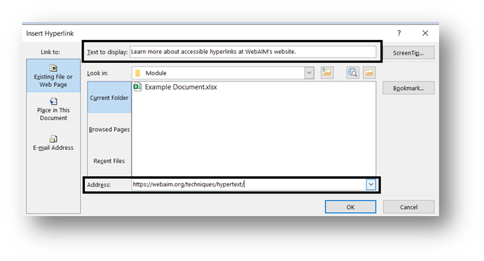
The colour of the linked text should be distinct and underlined. Hyperlinks are usually dark blue, though branding guidelines or preferences sometimes call for other colours.
Graphics
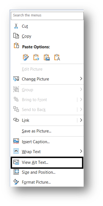
Alternative (alt) text should be added to any images or non-text content. Generally, alt text should:
- try to be concise and brief – usually a sentence or less.
- give the essentials of the visual information presented.
- provide any additional or necessary context that the visuals might refer to or require.
Avoid using any Mark as Decorative option unless the image is truly decorative. Learn more about the essentials of accessible content and alt text.
Tables
When creating tables, use built-in formatting options in the software. These will create structure around the information, allowing those with screen readers to navigate the information. If you prefer a table without lines, you can remove these afterward in the table formatting.
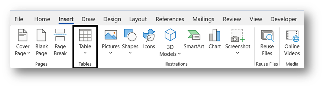
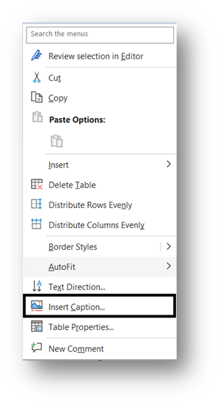
Avoid inserting images or screenshots of tables. These would require a lot of alt-text to explain. Instead, use table captions. In Microsoft Word, this can be done in the right-click menu, by choosing the Insert Caption option.
Design simple tables when possible, with only one header row and no merged or split cells. Alternatively, determine if data can be broken up into multiple simple tables. Learn more about the Essentials of Accessible Content relating to tables.
Document Properties
The recommended practice is to use simple but clear file names, without versions, dates or other metadata captured by the document properties. However, if your uses require you to use a non-specific naming structure, then add a meaningful title and suitable tags to the document properties. This provides clear information about the documents people access and gives context for screen readers and search engines. In most document processing software, the document properties are part of the File information.
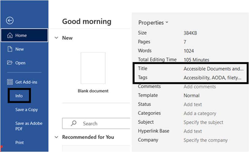
A title is most important. It provides the user with a meaningful document name, replacing the file name. Tags give further information about the file, which may help with additional context, effective sorting, and accurate search results.
When saving a document, always try to use the newest versions of the document type (i.e. .docx rather than .doc) to make sure the files are compatible with current software.
Accessibility Checker
At the very end of your document creation process, use your processing software’s built-in accessibility checker. For example, in Microsoft Word, use the accessibility checker in the Review tab. You can also find the accessibility checker in the File menu.

Learn more about using the accessibility checker in Microsoft Word.