Over 97% of Conestoga faculty identify that they use PowerPoint frequently in their teaching, and with good reason. Tried and true, PowerPoint has been the best known presentation software for the last 30 years. Its strength is often the familiarity we have with using it, and many other apps and services are based on its look and feel.
Often, we inherit PowerPoint slide decks in courses and need to update these before teaching with them. The following key practices will help you update these efficiently and accessibly.
To make sweeping overall changes to text, themes, and styling, use the Slide Master view. To get there:
In PowerPoint, click the View tab.
In the Master Views section, choose Slide Master.
Once there, select the top-most slide – this is the overall slide master.
Changes here impact all other slides.
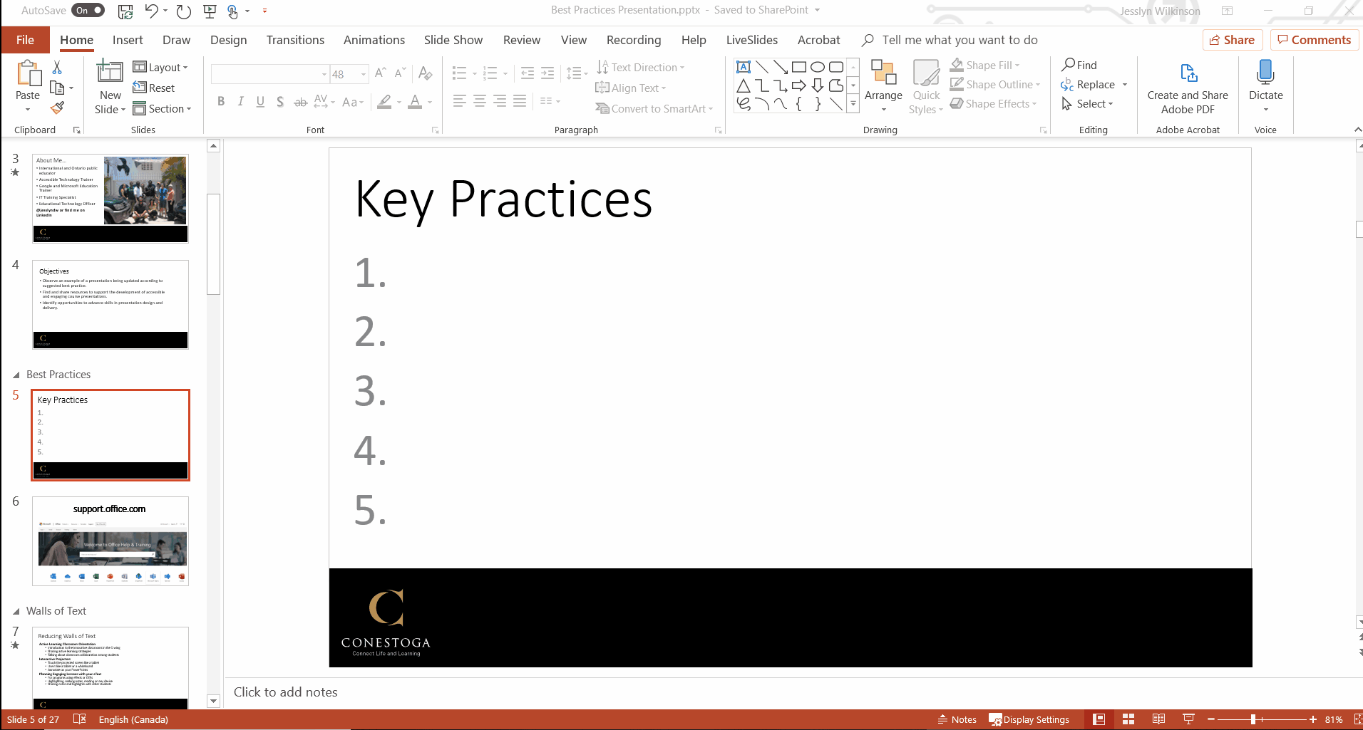
Opening Slide Master view.
While in the Slide Master view, make changes to:
the master layout of each slide layout you can build;
the theme – bring in the template you downloaded or choose something simple;
the font style (Arial, Calibri, or another sans serif font);
the font size of each level of text (at a minimum 18 pt);
any other universal components.
Then, close the Master view. The changes will apply across the presentation.
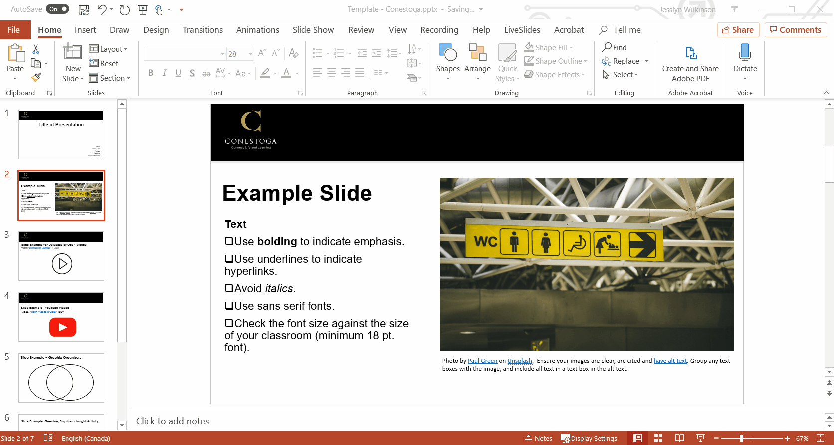
Build slides only using the template layouts.
Designing accessibly involves several key skills. Overall, try to keep your presentation building process simple. Use the default templates and structures to help build presentations.
When creating slides:
Choose New Slide or right click in the slide preview to add a slide;
Choose from the slide templates available;
Adjust the slide layout to suit your need.
Avoid the Blank slide template. This slide is unreadable to screen readers.
Inserting new slides.
Reduce the amount of text.
Decrease the quantity of text on a slide, focussing on key information, activity instructions and a blend of visual and written content. Increase the font to a minimum of 18 pt. and test out visibility in the classroom.
If you need to present a lot of text, use animations to present one paragraph at a time. Read aloud the paragraph as you present it. Allow students time to process what you have read.
Use the presenter’s notes area to collect notes about key speaking points or questions. Use the slide itself to describe active learning tasks and visual anchors.
“Using Presenters notes.” Screen shot by J. Wilkinson, December 6, 2019.
To see your notes when teaching, you’ll need to extend the display. The default set up in classrooms on campus is to duplicate the display.
How to extend the display on campus computers.
To extend the display on a Windows 10 device, like those found in most classrooms:
Right click on the desktop;
Choose Display settings;
Scroll down to the bottom of the settings window, and;
Set the drop down menu to Extend desktop to this display.
Extend the display on PC computers
Alternatively, use your phone to refer to presenters notesusing the PowerPoint app.
Build tables to read horizontally.
Often, tables are built to read vertically (up and down columns). However, screen readers move through tables horizontally (along a row). Take a look at the below example.
Member
Main Instrument
Secondary Instruments
John Lennon
Guitar, piano
Harmonica
Paul McCartney
Bass
Guitar, piano
George Harrison
Guitar
Bass, sitar, ukulele
Ringo Starr
Drums
Guitar, piano
This table is most comfortably read in a horizontal movement. Imagine if the table were reversed, where the names were along the top, and types of instruments along the side. This would interrupt the flow and sensibility of the information.
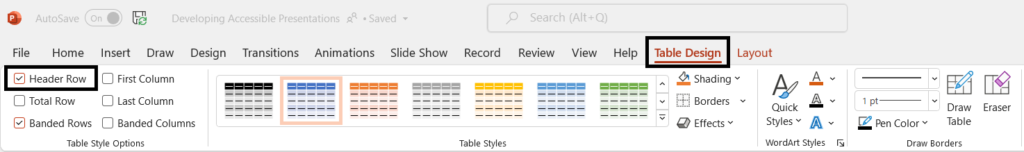
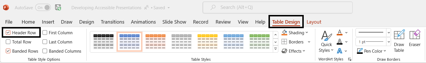
Also ensure tables have header rows. This is done by default in PowerPoint. Using banded rows (where colours alternate between rows) is optional, but can help sighted readers keep track of the row they are reading.
The Table Design tab allows you to choose the Header Row.
Create descriptive links.
To meet accessibility requirements, create links which are descriptive of the resource they will lead to. Some general advice:
Avoid using a raw url, as these are unpleasant to read.
Also avoid phrases like “click here” or “this link”.
Instead, use phrases which describe the resource the link directs to. This can be the title of the page, perhaps complemented by the source it’s coming from.
Take a look at the below examples:
Visit https://webaim.org/techniques/powerpoint/#tables to learn more.
Consider that a screen reader can navigate a page using only the links. If you read through the resource, reading only the links, would you understand what they directed to?
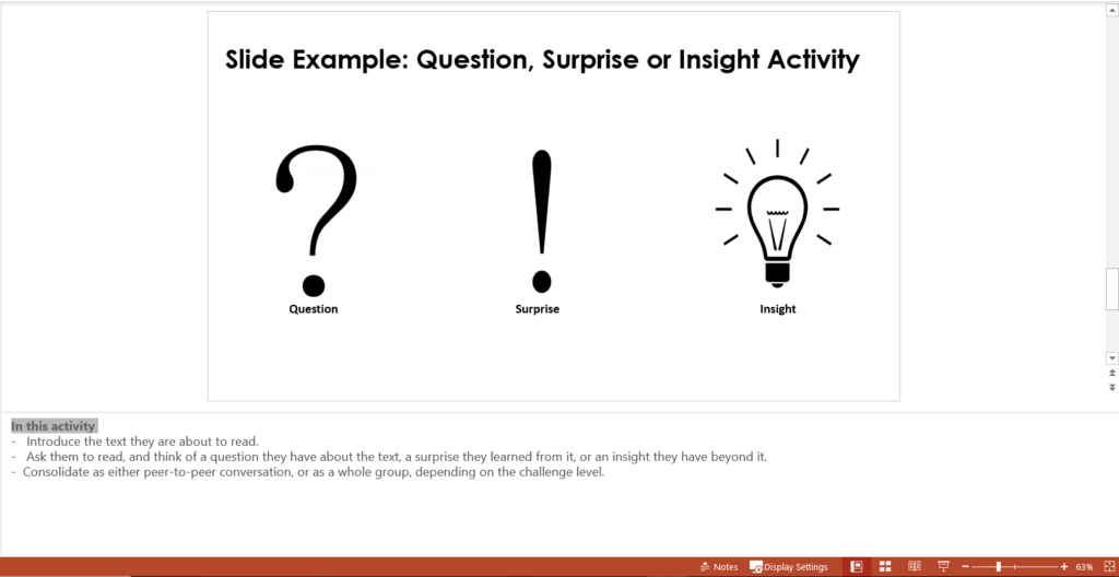
Avoid using SmartArt, charts, and shapes.
While these can be very helpful in designing visually appealing slides when using PowerPoint to make graphics or videos, they are inaccessible to screen readers when using PowerPoint to build presentations. If you do want to use these visual effects, make them accessible by building the graphic, then taking a screenshot of the design and replacing the SmartArt with the screenshot.
Choose a slide design that has a simple, high contrast colour combination and design. Safe colour schemes are white, black, medium blue and orange. Use orange as a highlight, as it can be hard to read as text.
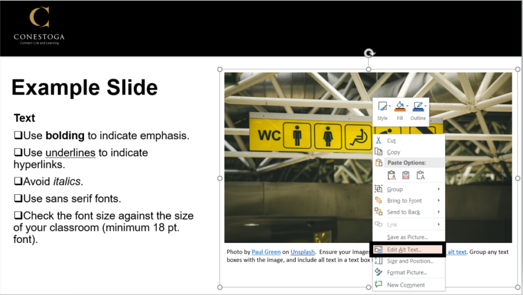
Describe what the image shows briefly (5-8 words).
If a graphic is more complex, you’ll need to include anything communicated by the graphic to a sighted audience in the alt-text.
“Right click to add alt-text.” Screenshot by J. Wilkinson, December 6th 2019.
Present any text in the images as text in the slide. Avoid constructing slides that use images as a substitute to text. Plan to narrate, describe and talk about images.
Use the Accessibility Checker
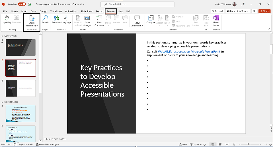
Use the Check Accessibility tool on each presentation.
In the Review tab, Check Accessibility.
A window will open with any unresolved issues.
Make sure all Errors and Warnings are resolved; Tips do not need to be resolved.
Check accessibility in PowerPoint.
Cite the sources you use.
Model the academic integrity you’d like learners to have. Add a References slide at the end of your presentation with references for images, videos and texts used.
These tips may help you get started with adapting PowerPoint presentations, but you may want to extend your skills.
Check out the LinkedIn Learning course “Redefining PowerPoint in the College Classroom.” Sign in with your Conestoga email and password. This course aims to provide some tips and suggestions for adapting PowerPoint to the college classroom.
Jess Wilkinson
Jesslyn is an Educational Technology Consultant at
Conestoga. An Ontario Certified Teacher, and holding a M. Ed.
and B.Ed., Jesslyn researches and promotes new technologies
for faculty to enhance pedagogical practices. She brings to
the role her experience as a Google and Microsoft certified
technology trainer and as a classroom teacher in South
Korea, Mongolia, and Ontario, focusing on special education
and assistive learning technologies. She is available for
workshops, consultations, and support with using technology
in higher education contexts.