David Sitler is a Faculty member in the School of Engineering. This teaching story describes Dave’s use of visuals in his teaching, including examples from his teaching materials that highlight course concepts.
By David Sitler
My teaching journey started at Conestoga as a student, where I studied graphic arts as well as Quality Assurance (QA), including statistical applications. I applied my knowledge of QA working for print companies for over 23 years.
In 2010, I returned Conestoga to teach 2nd and 3rd engineering students studying design and robotics about Quality Assurance systems. Quality assurance systems involving design, monitoring, analysis, and improvement are often new areas of learning for students.
With a graphic print background, it has been natural for me to support student learning by including photos, videos, and other visuals in my QA course Excel workbook files. Microsoft Excel uses the term “Pop-Ups” to refer to any displayed documentation in a window for a particular cell field. The goal of my use of these Pop-Up visuals is to provide students with additional layers of information relevant to the course content.
Teach About Concepts
I use visuals to introduce and teach about terminology as well as mathematical concepts, principles, and processes in Quality Assurance (QA).
Abstract concepts and multi-step processes can be overwhelming to students. By using pop-ups, I ensure that students are able to establish a mental link with visuals to make sense of the concept and its application in companies worldwide.
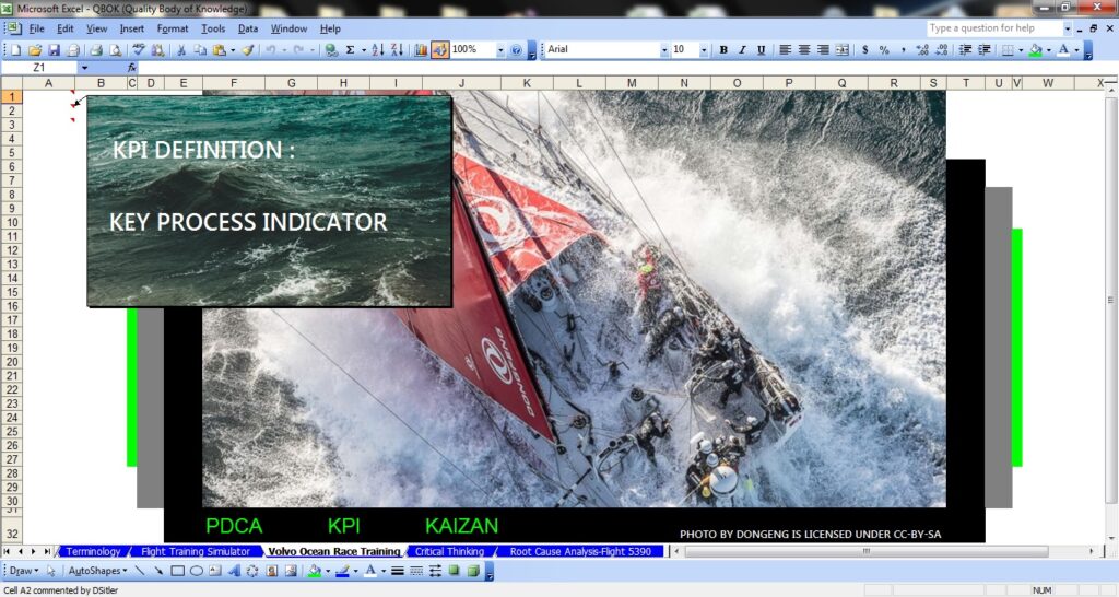
Visuals can also produce excitement in students when their understanding of statistical concepts is grounded in real-world examples. As shown in Figure 1, I show images of real events that demonstrate and bring to life the key concepts in the course.
Figure 1: A Microsoft Excel “Pop Up” used to discuss QA tools (e.g., Key Process Indicator) and their application to real-life events, such as the Volvo Ocean Race, an around-the-world sailing race that is approximately 28,000 nautical miles.
Skills Practice and Review
I have noticed since using visuals regularly a high level of student engagement on assignments and meeting deadlines.
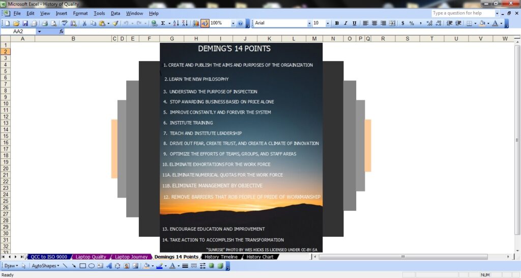
Pop-ups are included in my lesson content to help review foundational knowledge and skills. For example, I superimposed onto a photo of a sunset Deming’s 14 points (see Figure 2), and I use this visual for review with my class as we bring the History of Quality module to a close.
Figure 2: “Pop Up” listing Deming’s 14 points as a review image at the end of History of Quality Module.
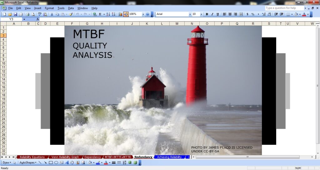
I also use visuals in the mock midterm and final practice exams, which provide a second layer of engagement with my students. In my Reliability Module, I share a slide (see Figure 3) designed for class discussion regarding Quality Analysis and Mean Time Between Failures. For exam preparation, the primary question I ask my students is, “How do you design a lighthouse to have a MTBF of less than .001?”
Figure 3: Excel Pop-Up featuring a lighthouse and crashing waves discussion about a Quality Analysis tool.
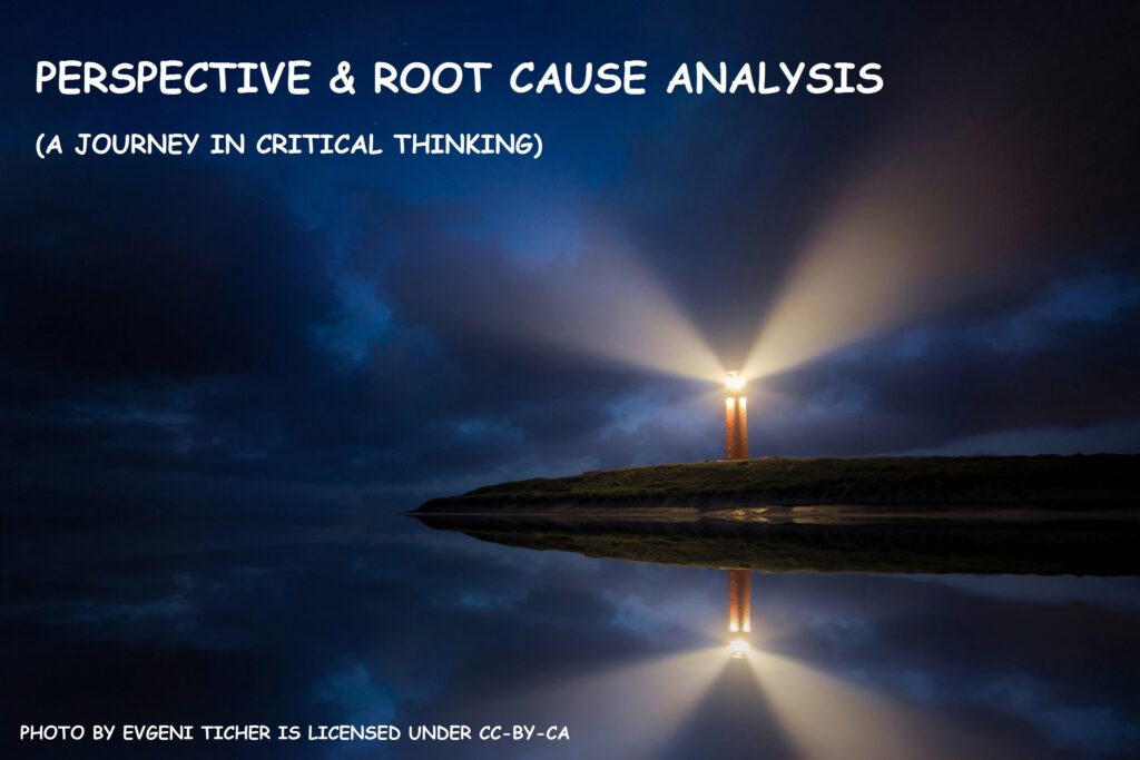
More recently, I have incorporated dramatic visuals as title pages and guideposts for different modules (see Figure 4). Students seem to have an easier time remembering and referencing course modules and subject content when they are linked with these visuals.
Figure 4: Perspective & Root Cause Analysis (A Journey in Critical Thinking) slide shared during class discussion.
Co-Creation and Using Student Feedback
To have students practice a QA process of continuous improvement called Kaizan, I ask students for feedback on the visuals I used. Their feedback has prompted me to add more visuals to teach abstract concepts, provide skills and exam practice, and engage students in the course more generally.
Using student feedback from the spring 2020 class, my students and I created a cross-reference search tool between subject terminology and course module titles (Figure 5). The cross-reference tool is also supported by Pop-Up visuals, which together will aid memory and studying for future students.
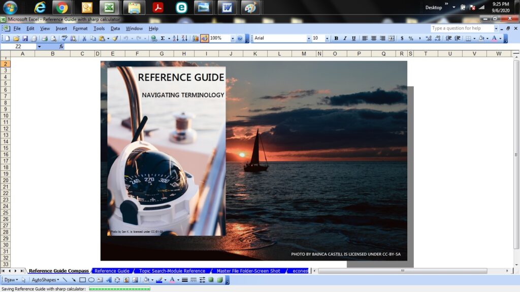
Figure 5: Reference Guide “Pop Up” that introduces subject terminology, featuring a sailboat on calm waters and a compass.
After observing students over the past ten years the addition of visuals builds confidence and interest in course material. The Pop-Ups in my course have become a very powerful tool for learning, and I hear from students that they enjoy them (Figure 6).
One of my students wrote me, saying “I really like the depth of tools built into the course.” When we discussed this further, she expanded on her comment explaining power of the graphics and photos to link subject material mentally. I’ve also had thank-you emails regarding the pop-ups, charts with arrows, and colour coding of math formulas.
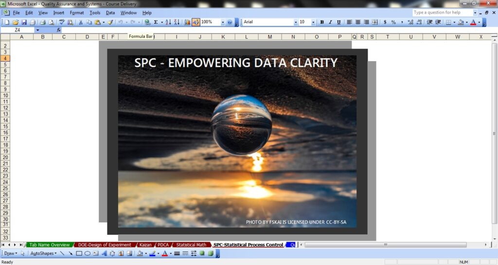
Figure 6: “Pop Up” featuring an inverted image to of the sky learn seven Statistical Process Controls (SPC) tools used in Quality Assurance.
Visual Pedagogy As Musical Performance
Using visuals in various ways my course materials on QA has changed how I think about my approach to teaching.
I am a trained classical guitarist, so I think about how I use visuals in my teaching as analogous to performing music. It is important to remember that written notes are not music by themselves. Only with a musician are musical notes given a voice.
Similarly, visuals in your course materials come to life through how you actively use them in your teaching. As with learning a new song from sheet music, I recommend that you practice explaining your message behind your visuals in ways that will engage students when you are in “performance.”
Figure 7: A photo of the Katowice Concert Hall located in Poland. Visual used in a Quality Reliability module.